All About Light Academia Design Style
Dark Academia is really having a moment in the spot light in current design circles, but if you feel like it’s a bit too heavy, and well, dark for your liking… you’re in luck, because today I’m talking all about Light Academia!
*Feature photo credit: Katie Hyatt/@saintsignora
After sharing more in-depth about Dark Academia style, the most common response I heard was that it was too dark, or that it felt almost depressing to some people.
I can understand both the ones who love the heaviness of the dark colors and the look as a whole, and those who feel like they love the bones of what the style represents, but feel a bit too overwhelmed by the dark color choices.
Today I’m happy to share more about Light Academia, and how it might check all of the boxes if you love specific elements of Dark Academia, but don’t enjoy the darker tones.
Photo Credit: Studio Ashby
Join me for my FREE workshop about 10 common design mistakes & how to fix them!
What is Light Academia?
The beauty of light academia is that it retains all of the character and elements that are beloved in Dark Academia circles, but it also incorporates a lightness that not only brightens up the space, but also makes it more widely attainable.
To sum it up really succinctly, Light Academia is Dark Academia with light walls. But I’ll dive more into the elements now.
This design style includes:
- Elegant maximalism that isn’t afraid to us bold colors, textures and layers.
- Striking architectural elements that harken back to the gothic era
- Romanticized old world elements
Photo Credit: A Sunday Porch
Color choices:
The colors used are beautiful muted jewel tones and colors you find in nature. The darkest of which are saved for accents and furniture pieces, with the lighter ones being used for the walls and ceilings.
This sample collection pulled together with Sherwin Williams paints is a lovely example.
Photo Credit: Sherwin Williams Facebook
If you like learning about Interior Design:
You should join my Elite Decorating Academy!
It is a comprehensive design course with 28 hours of teaching broken down into 160+ classes that are an average of 10 minutes long. I cover a wide range of practical interior design knowledge!
You can learn more at elitedecoratingacademy.com.
Light Academia Design Elements:
If you want to treat your walls with something other than simply paint, another option is wall paper! Elaborate floral patterns and William Morris-esque designs are often highlighted in this style.
Photo Credit: Moodnekdu
Crown molding, chair rail & window trim are all room elements that you will see played up in light academia. Sometimes they are painted dark to contrast with the lighter walls, as seen below.
Photo Credit: Pinterest
Fabrics with rich colors and texture fit in beautifully next to the floral wall papers and vintage furniture pieces.
Photo Credit: This Ivy House Tumblr
Photo Credit: Pinterest/Alice Grace Interiors
Photo Credit: Pinterest/Tumblr
Many of the furniture pieces feel inspired by professions of old. Lawyers cabinets, apothecary cabinets, desks with type-writers and type-setting drawers hung above them as decoration. Vintage books and candlesticks set a scene that feels frozen in time.
Photo Credit: Flickr
Photo Credit: Lone Fox
Vintage artwork and ephemera are often included in formal gallery walls or simply displayed simply on the walls themselves.
Photo Credit: Tumblr
Photo Credit: Pinterest
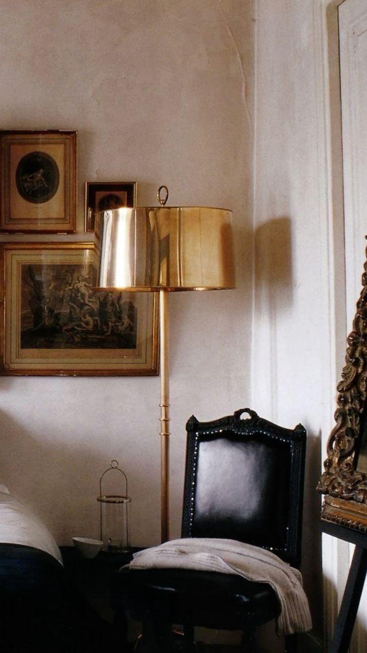
In addition to candlesticks, lamps are a big part of the academia aesthetic, bringing in the idea of soft library or office/study lighting.

Photo Credit: This Ivy House
I hope you enjoy this look at Light Academia! And remember, if you’re looking for more inspiration, you can review my post about Dark Academia, (Or HERE on YouTube) and chose the elements that speak most to you!
Related Design Style Posts:
- All About Grand Millennial Design Style
- All About Modern Farmhouse
- All About Cottage Style, Michigan English Cottage Home Tour
- All About Mid-Century Modern Design Style
- All About Bohemian Design Style
- All About The New CottageCore Design Style
- Full Home Tour | Nautical Decorating
- Mixing Design Styles
Pin This Light Academia Look for Later:
Link nội dung: https://cmp.edu.vn/light-academia-a62166.html